Croco
Toon
Shop online with peace of mind
Enhancing online shopping journey with strong focus on user’s experience and convenience.
Timeline
Apr 2023 - Aug 2023
Platform
Responsive web
My role
Researcher & designer
The product
‘Crocotoon.’ - A website dedicated to selling creatively designed printed T-shirts online, tailored for a budding startup. The company collaborates with local artists to offer a delightful selection of animal-inspired designs that are both fun and inspiring.
The project's objective is to gain insights into users' requirements throughout their online shopping journey. Through the utilization of user-friendly and intuitive user interfaces (UIs) with minimal obstacles, users can enjoy an enhanced experience, from their initial browsing to a smooth checkout process.

Fun, inspiring but also user-friendly
🐶 🐱 🦆 🦦
Fun, inspiring but also user-friendly 🐶 🐱 🦆 🦦
User research
Research goals
Gain a broad understanding of the e-commerce landscape in 2023 (including trends, attractions, and motivations).
Gather user perspectives and feedback on the products available on the website.
Explore user experiences and insights related to online shopping (including behaviors, frustrations, and emotions).
Assess the impact and roles of social media in the realm of online shopping in 2023.
Insights summary:
User research has shed light on essential requirements for e-commerce websites, as gleaned from users' feedback in face-to-face interviews. These include:
A reliable and trustworthy website layout.
Availability of promotional codes and affordable shipping options.
Product pages that are detailed and informative.
An efficient and user-friendly checkout system on the website.
Problem statement
Users often encounter some hardships during their online shopping experience which prevent them from completing a purchase for their desired items on e-commerce websites.

Primary persona: Mary Tran
A busy student juggling academic commitments and a part-time job frequently turns to online shopping for convenience. With limited time for in-person store visits, she values reliable and trustworthy shopping experiences. Additionally, she seeks affordable shipping options to optimize her limited budget.

2nd persona: Robbie Tan
A busy student who also needs to balance study and life responsibilities seeks a straightforward online shopping experience. This persona has a keen eye for special deals, such as discount codes, to enhance his overall shopping spree.
Ideation
Competitive audit report
Competitive audit goal
Gain insights into the strengths and weaknesses of currently operating websites
Identify the distinctive features of competitors
Understand the methods employed by existing websites for product sales, and provide effective user assistance on these platforms.
Key competitors
Our key competitors are Threadhead, TeePuplic, and Uniqlo who focus on printed T-shirt e-commerce with trendy illustrations or artist-exclusive works. Uniplo is the strongest competitor among them with affordable prices and high-quality products.
How can the findings benefit ‘Crocotoon’ design and layout?
Incorporating a hero image is crucial.
Carefully curate font and color choices to enhance the UI.
Avoid overwhelming users with an excessive use of illustrations and color combinations.
Prioritize clean and modern design for an improved user experience.
Ensure the checkout process features clear steps and allows for guest checkout.
‘How Might We’ questions
I explored a bunch of ideas to evaluate user experience of the website. It could be both positive and negative to tackle problems in different ways.
How might we create better engagement for users from the homepage?
How might we create a better and more secure shopping experience?
How might we create a logical checkout process for both users with and without an account?
How might we use colours and fonts to distract users from products?
How might we overwhelm users with too many product images on one page?
Crazy 8 activity for homepage layout
8 minutes for 8 ideas for homepage layout by answering the HMW (How might we) questions list.

Wireframe and responsive layout
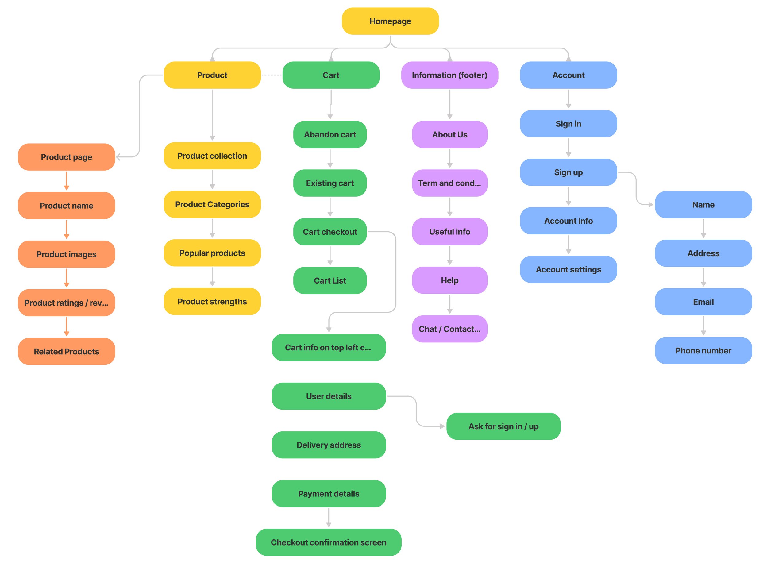
Information architecture for Crocotoon
Considerations for the overall structure for the website:
Simple layout from the home screen
Simple layout for product page
Simple checkout process
Paper wireframes and responsive layout
Following the establishment of the information architecture for the Crocotoon page, I proceeded to draft paper wireframes for key pages, including the homepage, product page, and collection page. Presented on the right is a responsive layout example for the homepage in three versions: desktop, tablet, and mobile (arranged from left to right).

Homepage
Focus on the big hero image at the top of the page, followed by the main collection tiles featuring images, titles, and descriptions. Users can easily see the core benefits and have the option to subscribe to the newsletter.

Product collection
At the top of the page, there's a collection cover accompanied by a brief description to provide users with an overview of the products they are browsing. Users can seamlessly select sizes and colors for items and add them to the cart without needing to navigate to a separate product page.

Product page
Breadcrumb links and product names stay on the top left corner for better navigation of users across pages. The product page is thoughtfully designed with large images, detailed descriptions, and user reviews, enabling users to gain a comprehensive understanding of the item before making a purchase.

Testing and iteration from early stage
Usability study goals
The e-commerce website caters to an online T-shirt business, and our goal is to assess the users' ability to effectively browse the product selection, make product selections, complete the checkout process, and successfully make payments using the Lo-fi prototype. Additionally, we aim to identify any challenges or difficulties that users may encounter throughout this process.
Key performance indicators
Conversion rates (how many users are able to finish the checkout process)
Time on tasks (how long it takes users to finish a task or navigate through the page)
User Error rate (how often users make mistakes across the page)
Findings from lofi testing
Links to products should be embedded in the product image.
The hero image and button are not clear enough yet.
There is a pattern in users’ behavior of selecting sizes in circles and colours in squares.
Participants had trouble understanding dummy text and empty frames for images during the test.
Lofi iteration
Lofi iteration would help define a better design scope for the mockup development phase. It is time and cost efficient for iteration of the website from an early stage. Below is an example of improved lofi version of the homepage after the usability test
Bigger hero image, collection description and button are place next to each other.
Full description of products and collections and button meaning are added
Added bestsellers section

Design system
Fonts and colours choices are based on what the users want from the user research results. UI components should create a relaxed and reliable sense for the users. Yet it still needs to be modern and a bit playful to match with the core ideas of the start-up’s brand and identity.


Mockup testing and iteration
Mockup testing findings
Users prefer to see shipping fees at the beginning of the checkout process so they can know their total fees.
The hero image is not clear with the collection name or its purpose.
The home screen needs to indicate more promotions and available promo codes.
Mockup iteration
After several rounds of usability studies, there are some noticeable fixes to apply to the mockups of the Crocotoon website. Such as
checkout steps orders
homepage hero design and its purpose
implication of the upper header bar and promotions for users
Final mockup

Going forward
Impacts
After the last round of testing and iteration, I conducted a quick test of the final design on a group of people and there were improvements in the usability of the Crocotoon website. The final design helps users go through the checkout process easily. Users can always see descriptions and information about products across the pages. Most users rated the website from 8 to 9 out of 10 and would come back to explore more when the product is out on the market.
What I learned
The project helps me understand the trends and habits of online users towards e-commerce sites. I understand more about the importance of usability study before and during the design process. Without the studies, the project’s direction would be vague and pointless. The process would be meaningless without them because the product could not serve the users’ needs.
Next steps
Incorporate animations throughout the page to enhance user engagement and interaction.
Create handoff document for developers.
Full report for this case study
Thank you
Thank you for spending your precious time to view my case study ‘Crocotoon’ and understand more about my work. I also have a longer version of this case study where I include more details about the responsive layout and usability research for this project. If you are interested, click the button to view more.
Explore more
Yum.
Catering app

PCCC
Fire safety app